Saturday, January 03, 2015
The Funny Marketing and PR of The Interview
The Interview is a comedy about talk show host and producer finding out that their show is a favorite of Kim Jong-un of North Korea. Once they land a live interview with him, the CIA recruits them to take him out.
Although the movie is mediocre to say the least (movie critics panned it), it got an unexpected boost from an unexpected source - hackers! They hacked Sony (the producer of The Interview) demanding to stop the release and threatened with violence if their demand was not met.
Needless to say, this put Sony in an awkward position. The movie studio decided to pull the release. MoviestarClooney and President Obama reacted, crying wolf.
In the end, Sony decided to release the movie online, with great success. The Interview is a bestseller on YouTube and Google Play. With more than 2M downloads, it generated $15M before Christmas 2014. The movie was also made available on Xbox Live and PlayStation.
According to the latest reports, the hackers do not hail from North Korea. It seems that it was an inside job.
No matter where the hackers are located, they did the movie a huge favor. They gave The Interview some serious marketing and PR that is worth its weight in gold!
Monday, September 08, 2014
Marketing Lessons from the Catholic Church
What is their marketing secret?
1. Conveying the mission statement
Representatives of the Catholic Church use a cool sales trick to convince.
They argue: “True, you cannot see our god. So how do you know he exists? Well, you cannot see trust, but you trust your parents. You cannot see love, but you love your family.”
2. Why being Catholic is important
To win and retain customers, a business has to convince them of the added value of its offering. The Catholic Church explains that its main “product” was so important that his birth started the anno domini (AD) - Christian calender worldwide. This underpins what professor Robert Cialdini describes as the Principle of Authority.
3. Overcoming peer pressure
When the majority of the peers of a (potential) “customer” has a different set of norms and values and/or religion; it’s hard to champion the Catholic cause. But the Catholic Church uses in such cases an age-old and proven strategy – social evidence.
They point out that out of a current world population of 7 billion souls, 2 billion are Catholic. Quite an impressive market share!
4. Social engineering
One of the main “threats” that the Catholic Church faces, is an environment where the majority is not baptized let alone consists of practicing Catholics. The winning argument in such a case? During the time of JC, baptism was introduced for the first time. During the first day alone, 1,300 people were baptized, Quite an impressive conversion rate!
5. Retaining believers
One of the main challenges of the Catholic Church is to retain believers and handle crises (e.g., child abuse claims). The Pope as the CEO of the Catholic Church is facing the same challenges as many of his Fortune 500 counterparts: protecting and promoting the values of the enterprise and executing its mission while adapting to changing times and conducting crisis management to survive.
As the current CEO, Pope Francis is doing a good job. Let’s see how he steers his multinational during the coming decades…
Friday, December 20, 2013
Branding Santa – A Hilarious Marketing Lesson from UK Agency Quietroom
Santa Claus has been a household name for centuries, featuring on greeting cards and product packaging, and appearing in ads, movies and TV shows. So what if Santa decided to brand himself like any other enterprise?
The creative minds at Quietroom, a UK branding agency, made a presentation that explains in detail what the new *Santa* brand is all about. But apart from being a wonderful spoof, it also teaches us all the elements of today’s branding policy.
It’s especially useful for anyone working in the field of marketing & PR, graphic design, and even law (just read the legal disclaimers at the bottom of the pages!).
Mission Statement
The first page starts with the mission statement that is as meaningless as many others that are floating around.
"*Santa* is a Concept, not an idea. It's an Emotion, not a feeling. It's both Yesterday and Today. And it's Tomorrow as well.”
The Brand Explained
In the Age of Acronyms, Santa just has to be an acronym!
*Santa* stands for:
* The introductory asterisk reminds customers of a snowflake alighting on the eyelash of a fawn.
SAN The first three letters represent South And North. We are headquartered in the North, but our reach is global.
N The N symbolizes nitrogen, the most abundant atmospheric element, calling to mind the abundance of gifts we distribute.
TA The final two letters are the (abbreviated) thanks of the world’s children.
* The terminating asterisk points to the polar star, and hence the birth of dreams.
Brand Promise
A brand must represent certain values and evoke emotions. That’s why the “brand promise” is explained as follows:
What does *Santa* represent? E(x)cellence, (m)easurability, (a)ccountability and (s)now -(X-mas)
To further explain the brand values, (re)branding presentations contain a bunch of Venn diagrams trying to explain target audience, USP, public image, etc.
In this case, it shows the brand value of Santa, Ho Ho Ho, and Rudolph.
Brand Journey
In this section, the agency or designer tries to explain (justify) the new brand. It is normally an analysis of the history of the brand, competitors and market trends. But what if you don’t have a lot to say? Well, you can go for metaphors…
In this case, they compare Santa to a bird (stork), a river (Danube), a biscuit (Hobnob), and a holiday (Eastern).
Brand Concept
The branding agency or designer normally has a vision about the new brand and how it will work for the entity. Most of the time, they opt for a complicated diagram or illustration that tries to explain the whole (re) brand concept/process in one shot.
In this case, they came up with the Brand House “a brand is a sack on the sleigh of belief”.
Brand Justification
This section “justifies” the (re)designed brand. It tries to explain the added value that the brand will bring to the company/entity.
Logo, Color and Font Use
A logo is part of the corporate or personal brand. Apart from being a differentiator, it is also a major asset. To prevent subsidiaries, subcontractors, resellers and employees to get “creative” and “improve” the logo, a company normally has guidelines (style guide) for using the logo, fonts, colors etc. in place.
Corporate colors and the typeface are also part of a corporate identity. In many cases, designers opt for mixing two pantone colors to create a unique color for the company. The same applies for fonts. Once a company has its own font, it becomes its IP.
In this case, the *Santa* logo cannot be "altered, adjusted, changed, adapted, modified, varied, reformed, revamped, refined, reorientated, transmuted, metamorphosized, customized or tailored in any way."
Tagline, Slogan and Writing Guidelines
Many companies have a tagline to explain its mission. Famous taglines are “Just do it” (Nike), “sense and simplicity” (Philips), and “Got Milk?” (California Milk Processor Board).
*Santa* has its own tagline: “Snap it, Clap it, Wrap it”. It replaces the previous “Meet it, Greet it, Eat it”.
A slogan is designed for branding a specific ad campaign or event. For 2013, Santa’s slogan is “Never Knowingly Undersnowed”.
The writing guidelines instruct marketing and copywriters which phrases to use or avoid, whether writing should be formal or informal, how to use abbreviations, etc.
In this case: *Santa* is: fond of children, generous, round and jolly, and rosy cheeked. *Santa* is not: a bit creepy, a mug, morbidly obese, and half-cut.
Magic Quadrant
The Magic Quadrant (first designed by the Boston Consulting Group) shows how competitors rank by comparing two characteristics. It visualized who the main threats for a company or entity are.
In this case, “Fatiness” and “Beardiness” were used to chart the strengths of potential competitors. Miley Cyrus is the least threat (being slim and beardless) while Harry Potter's Hagrid is the main competitor based on body mass and beard. King Henry VIII and actor Brian Blessed also pose a threat.
Customer Profile
This section identifies the target audience. The wants and needs of the potential customer drive the brand.
In this case, the target audience consists of “people that believe”. A graph relates the age of a person to his/her believing in (1) Santa, (2) communism, and (3) God. The target audience consists of children up to 10-15 years. After 25, people don’t believe in Santa anymore…sorry *Santa*!
To read the *Santa* Brand Book of Quietroom, click here.
Wednesday, November 13, 2013
Tweet Genie - A New Tweet Analysis Tool for Marketers
Monday, May 13, 2013
Abercrombie & Fitch CEO Mark Jeffries’ Marketing Mistake
Thursday, February 21, 2013
Maker’s Mark Magnificent Marketing Move
- When something goes wrong, let customers vent.
- Emphasize that you listen.
- Show that you reacted to your customers’ opinions (social media are perfect for this).
- Be sincere in your apology.
- Be transparent.
Saturday, July 14, 2012
Virgin America's Brilliant Marketing Move
Over the years, the outfits became more professional and men joined the ranks. Only a few airlines have redesigned their uniforms in recent years.
It took Virgin America 18 months to come up with the new look.
Simon Kneen, Banana Republic's creative director, designed the uniforms so crew members could move around without losing buttons or getting stuck on chairs.
With the new uniforms, Virgin achieves:
- Great publicity
- Great branding
- A new income stream
Tuesday, June 12, 2012
Marketing Cute Coins - Royal Canadian Mint's Clever Marketing Strategy
Historically, a Mint was established as part of a respected monetary system.
To state it more simply, it is a place where money is coined. Most Mints are
governmental owned, such as the Royal Canadian Mint. Minting coins and printing
money bills is not cheap. The Mints came up with a clever marketing strategy to
make money (no pun intended): minting a limited amount of commemorative or
collector coins. As part of its clever marketing strategy, the Royal Canadian Mint's latest collectible coin features a dinosaur whose skeleton shines at night from beneath its scaly hide. The coin actually features two images on one face. The other side depicts Queen Elizabeth II. (No, she does not glow in the dark). Coin designer Julius T. Csotonyi infused the design with a photo-luminescent element so that, when the lights are on, a depiction of the dinosaur appears, but when the lights are off, the dinosaur’s skeleton glows in the dark. According to the Mint, the luminescence will not fade with time.
Made of cupronickel, the coin has a face value of 25 cents and its sales price is $ 29.95. It is much larger than a regular Canadian quarter, which avoids confusion. The coin shows an artist's rendering of Pachyrhinosaurus Lakustai, a 4-ton, 26-foot dinosaur discovered in Alberta in 1972 and named after Al Lakusta, the man who stumbled on its bones in the Pipestone Creek bone bed.
Because the coin is so gimmicky, it received a great deal of media attention. Articles about the coin appeared in a slew of newspapers and technology sites, including CNET and Wired. The coin was also mentioned on television news programs and in a segment “Canada’s Currency Coup” on the Colbert Report. As a result, the coin already sold out of its 25,000 mintage and is selling for a substantial premium to the original issue price on eBay.
But the Royal Canadian Mint is not stopping here. The quarter is the first of a series of four coins. All these coins will feature photo-luminescent prehistoric creatures. These coins are part of its marketing and sales plan. Overall, the Royal Canadian Mint is planning as many as 150 numismatic products and collectibles for 2012.
Wednesday, April 04, 2012
Library Marketing – How A Dutch Library Enticed Social Media Users
In The Netherlands, many libraries had to close down or merge. As a result, they lost their function as a local information hub and place to relax and recharge
One library came up with a clever reach out plan. It hosted a meeting of a local Social Media Club and made sure to inform the media about it. The director hosted the event to turn the digital trailblazers into advocates for the library. As part of his strategy, he made is very personal by serving each participant a cup of coffee. They happily tweeted about this positive experience. To keep an ongoing relationship, the director gave each of the 80 participants free membership card (valid for 6 months).
Why was this marketing strategy so successful?
- The experience was very personal, which is a nice change from digital interaction
- Participants will associate the digital event with the library
- Giving a free membership card is soft and non-intrusive “sell”
- By personally serving coffee, the director built one-on-one relationships
- The library showed that libraries and digital communities are a nice fit
- Participants were turned into brand advocates, using their social media to share their positive experience
(Image: "Book 4.0" artwork)
Sunday, November 27, 2011
A Cute and Creative Application of QR Code
Quick Response (QR) is a good tool for creative marketing. A QR code is a 2D barcode. It is similar to the well-known 1D product barcode, but a QR code can contain far more (and different kinds of) information. Reading a QR code is different from reading a standard barcode. Apart from scanning the code with a barcode reader, the QR code can also be read by using a free application on a smartphone. QR codes can be linked to a company’s website, a YouTube video, a photo or any other hyperlink.
Marketers quickly saw the possibilities of the QR code and started using them for all kinds of B2C campaigns. A QR code is easy to create as an image. It can be printed on business cards, folders, flyers, products, and yes, even cookies.
The German company Qkies offers its consumers the ability to bake cookies with edible QR-codes. The company allows its customers to put their own personalized code on top of the cookies. One package consists of dough and 10 edible QR codes. (Yes, the buyer must bake the cookies first). On the website of Qkies, the “baker” can choose to which website the QR code should point to.
Qkies is the brainchild of a German food company and DFKI, the German Research Center for Artificial Intelligence.
Sunday, October 30, 2011
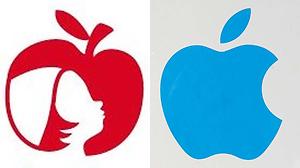
Apple Takes Action Against Cafe in Bonn for Infringing on Its Famous Logo
Apple (NASDAQ:AAPL) has sent a “cease-and-desist”letter to “Apfelkind“, a cafe in Bonn, Germany. Apfelkind („Apple child“) uses a logo consisting of a red apple with the silhouette of a child inside. Owner Christin Römer submitted the design to the Trademark and Patent Bureau in Munich, Germany. She applied for 42 classes (categories), including fashion and service provider. She also stated that she would like to franchise her “Apfelkind” concept.
The legal eagles at Apple noticed that the two logos are very similar. Apple lawyers promptly objected to the submission and issued a “cease-and-desist” letter to Ms. Römer.
She immediately involved the German media, playing the David vs. Goliath card.
But things are not as clear cut as Ms. Römer might think.
The problem is not just having the logo on the building. She also sells merchandize with the logo (such as cups) online. She also writes on her website that she is planning to expand her webshop (there is already a picture of pillows featuring the logo).
Furthermore, her submitting the logo in the category “service provider” and announcing that she wants to build a franchise show that she is a savvy business woman.
Her claim that her logo was inspired “by the apple trees of my neighbors” is weak to say the least. She hired a graphic studio to do the design. Any reputable graphic designer will warn against piggyback-riding on famous logos.
How will it end? Ms. Römer has two choices: to spend a lot of money fighting for her patent, or changing the design and removing it from the “service provider” category.
In the mean time, she got lots of free publicity. She should realize that multinationals invested a fortune in their brand and are therefore highly protective of their logo.
The lesson to be learned here is to make sure that your logo, font type, slogan or color scheme do not even vaguely resemble those of other companies. Be original! It is not only better marketing, but also prevents legal problems.
Monday, October 10, 2011
Finding your target audience – the Jim Beam lesson
Jim Beam launched its Red Stag in 2009. This black-cherry infused bourbon was aimed at the male market. The company opted for a strong masculine product name and enlisted rapper Kid Rock to promote it. Much to the company’s surprise, the drink was a hit with women. Female drinkers appreciated the sweeter taste compared to regular bourbon.
Jim Beam began to investigate. As its global chief marketing officer Kevin George stated: “We wanted to understand the emotional reasons why women drink wine or spirits. While women make up almost half of spirits drinkers, they consume just a quarter of the volume sold.”
As a result, after 216 years of marketing almost exclusively to the male drinks market, Jim Beam is embracing women. The company introduced three new products aimed at female drinkers: Courvoisier Cognac infused with red wine, Pucker vodka and low-calorie Skinnygirl cocktails. Skinnygirl Cocktails, created by American reality TV personality Bethenny Frankel, was purchased by Jim Beam. Since the drinks contain only 100 calories per serving, they are attractive to women wishing to avoid the calories of a typical 480-calorie restaurant margarita.
But also Jim Beam’s existing Sauza Tequila brand benefited from the switch to marketing towards women. As research shows, about 57% of all the Tequila sold in the US is mixed in margaritas. Two-thirds of those margaritas are consumed by women.
Sauza began a marketing campaign based on the idea of a “ladies night in”, hosting at-home margarita parties and advertising on the Food Network. Sauza teamed up with restaurants to create what they called “Sauzaritas”
Based on its success with the female market, Jim Beam is planning to introduce a new line of chocolate liqueurs called “Crave”. The drink will blend flavors such as mint, chili pepper and cherry.
Jim Beam’s marketing story proves that companies should never take their market audience for granted. They should be open to step out their comfort zone and check new opportunities.
Monday, September 12, 2011
Jonathan Stark’s Starbucks coffee card – a clever marketing trick from an app developer?

Mobile application developer Jonathan Stark (a mobile app consultant from Providence, Rhode Island) made his Starbucks card available for anyone by offering his Starbucks Mobile app on the Web for others to use.
His message read:
“Need a caffeine boost? Use Jonathan's card. Want to buy a cup of joe for a pal? Or, more likely, someone you've never met? Use Jonathan's card.”
Stark posted an image of the electronic card, inviting anyone to copy it to their own phones.
"Jonathan's Card is an experiment in social sharing of physical goods using digital currency on mobile phones ...," he wrote on his site. "Based on the similarity to the 'take a penny, leave a penny' trays at convenience stores in the US, I've adopted a similar 'get a coffee, give a coffee' terminology for Jonathan's Card."
Needless to say, lots of people followed up on this call to action. After its launch in July 2011, the campaign went viral once it was covered by several tech blogs.
According to Stark, more than 177 people spent $3,651 on the card; not bad considering that the original balance was only $30 balance. A couple of times, some users transferred money to their own Starbucks accounts.
"It's been a bit emotional, actually," Stark stated. "People's reactions have ranged from accusing me of stealing to thanking me for renewing their faith in humanity. It's been very uplifting overall, but it does hurt when the occasional pessimists send negativity my way."
How did Starbucks react? “We think Jonathan's project is really interesting and are flattered he chose Starbucks for his social experiment. We're curious to see how his project continues to evolve."
In the end, it all came to an end due to Sam Odio, who wrote a script that let him transfer large amounts of money from Jonathan’s Card to his own personal card. Once Starbucks became aware of Odio's efforts, the company shut down Stark's card. "We were concerned with fraudulent activity," a Starbucks’ spokesperson said. "Starbucks was supporting the program from the sidelines, because it was an interesting thing, and in line with the pay it forward mentality. But the very concept of sharing a card violates our company's terms of service. "
One thing is certain: Jonathan’s card was an interesting marketing experiment in collective consumption and mobile currency – and excellent branding for Jonathan Stark himself!
Friday, August 26, 2011
Using sweepstakes and contests for marketing
At exhibitions and events, sweepstakes and contests are a popular marketing strategy. It is a great way to get leads: visitors submit their business card and the winner of e.g., a trip or iPad is announced.
At a sweepstakes, the winner is chosen by the luck of the draw. At a contest, the winner is chosen based on some merit, such as best photo, most votes on a video, best slogan, etc.
In the U.S., federal laws governing marketing promotions have been in place for decades. But also many states regulate sweepstakes, such as Massachusetts, Michigan and Virginia that all ban tobacco-related promotions. California, Tennessee and Utah highly regulate promotions involving alcohol.
Every sweepstakes and contest must have “official rules” and they should be easy to find by the public. The easiest way is to link to the rules where it is easy to find and read them.
What should the rules entail?
- “No purchase necessary.”
- The alternative method of free participation.
- Geographic area of the sweepstakes and/or who is eligible to participate in the sweepstakes.
- Opening date and scheduled termination date of the sweepstakes.
- Complete name and address of the sponsor and promoter of the contest.
- Number of prizes, the accurate description of each prize, the retail value of each prize and the odds of winning each type of prize.
- Whether all prizes offered will be awarded and how the prizes will be awarded.
- Manner of selection of winners and when a determination of winners will be made.
- Where and when a list of winners can be obtained.
From a marketing standpoint it is clever to limit the value of the prize to e.g., an eBook, a voucher of $25 for an online store, or a free product to avoid tax complications for the winner.
Sweepstakes and contests ate a great way to promote and grow business or promote a corporate blog. It is also used on Twitter and Facebook to get followers.
Sunday, October 17, 2010
Silly Bandz marketing success
Silly Bandz is a great example of how marketing of a fad item works.Silly Bandz are silicone rubber bands in the form of animals (e.g., tree frogs, dolphins, geckos), objects, letters, Barbie, and Justin Bieber. They can be worn as bracelets, and revert to their original shape once taken off. They are mainly aimed at Tweens, who collect and trade them. But boys and girls as young as 5 have start wearing (and trading) them.
Robert Croak is the rubber band man who came up with the idea after seeing a similar product designed for Japanese offices. His business has grown 10 times in the past six months. Croak is currently shipping millions of Silly Bandz weekly.
What contributes to the marketing success of the Silly Bandz fad?
Appeal
The shapes and colors appeal to te target market. The bands are coveted by both boys and girls (the picture shows a 5-year old boy showing his collection), and several ages groups (from 5 up to 15). The appeal is global, which explains its quick adoption in non-US markets. The bands also give their owners a certain status and bargaining power among their peers.
Product strategy
Silly Bandz cleverly discontinues less popular shapes, while introducing new ones (e.g., Justin Bieber, Helllo Kitty, and iCarly).
Collecting and trading
Collectability always extends the lifespan of a fad. The longer the bands are collected, shared, and traded, the longer its product lifecycle (and income stream) will be.
Affordability and packaging
In a US retail store, Silly Bandz sell between $3 for a pack of 12 to $5 for a pack of 24 items.
The product is affordable for the target group that has the spending power. As Croak puts it: "Let's face it. In a tough economy, any parent can afford to spend $5 to get their kid something they really want." The packaging is a small, no-nonsense, transparent plastic bag; "what you see is what you get".
Promotion
Croak uses social media for marketing buzz, including a blog. The Silly Bandz Facebook page has over 700,000 fans. Its Twitter feed has more than more than 15,000 followers. As Michael Lewis, CEO of Forever Collectibles points out: "it's 100% viral. When one kid finds it at a store, in two seconds the kid or his mother is on the phone texting that they've found them."
Additional Products
In addition to Silly Bandz, there are also Silly Ringz, Silly Necklace, SillyBandz Caribinerz, and Silly Buttons.
But Silly Bandz is facing two major threats:
- Some schools have banned the silicon bands since they could pose a distraction (e.g., kids trading in class) or pose a physical danger (e.g., used as rubber bands to snap others).
- Although Silly Bandz is trademarked, it was only a matter of time, until other brands would appear. Silly Bandz has its share of imitations/competitors, e.g., Zanybandz and Crazy Bands.
But for now, Silly Bandz are still selling like crazy. Silly Bandz also seem to enter the adult market - as a flirtation tool. Singles at bars and clubs are slipping the object of their desire a Silly Band to show that they are interested in a stranger that they just met there. This could open a whole new market segment for Silly Bandz.
Friday, January 22, 2010
Using the Obamas as a marketing asset

The Obamas are a marketing asset – as quite a few companies and organizations know. Going by the assumption “it’s easier to ask for forgiveness than permission”, they use the Obamas in their PR.
The outdoor clothes company Weatherproof noticed that the President was wearing one of their coats when photographed on the Great Wall of China. The company promptly used this news picture for the advertisement touting the tagline 'A Leader In Style'. In the pic, Obama stands alone in a strike, rugged pose – perfect for the company’s image and brand. The picture was taken by the Associated Press, and the clothes company bought the right to use it in an advert. They promptly turned it into a giant-sized photograph on a Times Square billboard. AlthoughWeatherproof did not seek permission from the White House, claiming it didn’t need to since the billboard does not claim Mr Obama endorses the product.
Freddie Stollmack, CEO of Weatherproof stated: 'He didn't come to us. It's just a great looking jacket on a great looking president. Mr Stollmack said he thinks the White House should congratulate his company for making Mr Obama look so good. We did this in good faith. This is an image that we thought would enhance the President of the United States.' He added that although another advertising company had accepted the billboard, the New York Times, the New York Post and Women's Wear Daily had all rejected a similar advert for their newspapers.
The White House was not amused. Deputy press secretary Bill Burton said that the White House has a long-standing policy that disapproves of the use of President Obama's name and likeness for commercial purposes.
But also Mrs. Obama has been used for PR purposes –without her position. PETA used her image in a new ad. PETA states that the first lady has committed to not wearing fur and "the world should know that in PETA's eyes that makes her pretty fabulous." The anti-fur poster features an image of the U.S. First Lady along with presenter Oprah Winfrey, singer Carrie Underwood and supermodel Tyra Banks, under the slogan 'fur-free and fabulous!'
The image that the People for the Ethical Treatment of Animals used is the one from her first official White House portrait, taken in February last year. Ingrid Newkirk, president of PETA, confirmed that PETA had not asked for Mrs. Obama's permission to use the portrait, since they knew the First Lady could not officially endorse an anti-fur campaign advert. PETA also insisted, that they used her image in its Washington advertising campaign based on White House confirmation that she does not wear fur. The new adverts featuring Mrs. Obama appeared in Washington's Metro stations, magazines and PETA's website.
It is unclear whether the White House can prevent companies from using the Obamas’ images in advertising campaigns. Shortly after he took office last year, the White House launched a crackdown on 'Brand Obama' and insisted on control over the merchandising free-for-all in the wake of his inauguration. But it is difficult to enforce, especially since the chances for companies and organizations (especially outside of the US) to be sued are slim. Low cost, low risk, huge impact - a marketing dream come true…as the following clip shows....
Monday, January 04, 2010
Avatar – the marketing success of an expensive blockbuster