Sunday, October 30, 2011

Apple Takes Action Against Cafe in Bonn for Infringing on Its Famous Logo

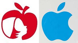
Apple (NASDAQ:AAPL) has sent a “cease-and-desist”letter to “Apfelkind“, a cafe in Bonn, Germany. Apfelkind („Apple child“) uses a logo consisting of a red apple with the silhouette of a child inside.

Owner Christin Römer submitted the design to the Trademark and Patent Bureau in Munich, Germany. She applied for 42 classes (categories), including fashion and service provider. She also stated that she would like to franchise her “Apfelkind” concept.

The legal eagles at Apple noticed that the two logos are very similar. Apple lawyers promptly objected to the submission and issued a “cease-and-desist” letter to Ms. Römer.

She immediately involved the German media, playing the David vs. Goliath card.

But things are not as clear cut as Ms. Römer might think.

The problem is not just having the logo on the building. She also sells merchandize with the logo (such as cups) online. She also writes on her website that she is planning to expand her webshop (there is already a picture of pillows featuring the logo).

Furthermore, her submitting the logo in the category “service provider” and announcing that she wants to build a franchise show that she is a savvy business woman.

Her claim that her logo was inspired “by the apple trees of my neighbors” is weak to say the least. She hired a graphic studio to do the design. Any reputable graphic designer will warn against piggyback-riding on famous logos.

How will it end? Ms. Römer has two choices: to spend a lot of money fighting for her patent, or changing the design and removing it from the “service provider” category.

In the mean time, she got lots of free publicity. She should realize that multinationals invested a fortune in their brand and are therefore highly protective of their logo.

The lesson to be learned here is to make sure that your logo, font type, slogan or color scheme do not even vaguely resemble those of other companies. Be original! It is not only better marketing, but also prevents legal problems.

Monday, October 24, 2011

Eight Simple Tps for Starting and Using Social Media

1) Establish a presence

This may sound redundant, but you need to be on the social media trinity: Facebook, Twitter, LinkedIn. LinkedIn is great for professional networking. Facebook is a more informal way to connect, although the business pages are very much B2B. People can “like” your business page, which is great for branding. Twitter is the cocktail party in social networking; just keep the tweets business-related!

2) Engage your peers

Your peers are your potential customers, business partners or employers, so you need to engage them with articles, blogs, comments and postings. It’d s great way to establish your brand and position yourself as a thought leader.

3) Make sure your target audience knows where to find you.

You need to promote the links to your Facebook, Twitter, LinkedIn and blog. An easy (and often overlooked way) is your AutoSignature. Make sure that you also link your website and blog to your Facebook, Twitter and LinkedIn.

4) Find your voice.

As the French say: “c’est le ton qui fait la musique”. Decide how you want to communicate with your target audience. Do you want to keep it formal (for B2B) or informal (for B2C)?

5) Pace yourself.

Avoid starting with many tweets and blog posts a week that are impossible to keep up. Too much activity can be overwhelming and lead to burnout. It’s better to set up a schedule for your social media and stick to it.

6) Keep it simple.

Tweets, postings and blogs should be fun and easy to understand. Try to avoid using complex language or concepts.

7) Visuals rule.

A picture can tell a thousand words. Use visuals in your blog and postings; people love it!

8) Engage.

You are using social media, so be social! React, like, and comment to other people’s posts. Be generous and informative. Again, it’s a great way to brand and position yourself as a thought leader.

Want to learn more? Contact me at www.tiptoppr.com

Saturday, October 22, 2011

Tattoo Barbie - Mattel's Clever Marketing Ploy

Mattel’s latest Barbie doll sports pink here, a trendy outfit and has tattoos across her left arm, neck and chest. This limited edition Barbie is the result of a cooperation between Mattel and Italy-based brand Tokidoki. The doll is marketed as a collector’s item for adults and sells for $50. This pink-haired, tattooed Barbie wears black T-shirt with heart and crossed bones, leopard print leggings and a dog called ‘Bastardino’. Supposedly, this has invited the wrath of parents across the U.S, and was debated on the O’Reilly Factor.

There is some understandable skepticism if the so-called outrage of concerned parent is real, or a clever marketing ploy by Mattel.

The Daily Mail did some digging and found a number of obscure websites for “tweenage” girls where people had a negative opinion of Barbie’s tattoos.

However, the majority of the experts that normally pipe up were silent. Quite likely, they just don’t see it as a big deal.

It’s not the first time that our Barbie got tattoos. In 1999, Butterfly Art Barbie was withdrawn from stores after parents complained. In 2009, the company released Totally Stylin’ Tattoos Barbie, a doll with removable sticker tattoos.

But it seems that in 2011, nobody seriously cares about a doll with tattoos. That leaves us with an interesting marketing question: did Mattel create artificial controversy to sell its latest Barbie? Knowing Mattel – quite likely! As usual, Mattel is laughing all the way to the bank. The doll is already sold out......

Wednesday, October 19, 2011

A painful lesson in copyright and graphic design – inspired by Steve Jobs

Social media has changed the game; in more ways than one. Let’s look at the case of Mr. Mak.

Mr. Mak, a university student in Hong Kong who is an aspiring graphic designer. Upon the passinga way of Steve Jobs, he designed a graphic of the Apple logo with a silhouetted profile of Mr. Jobs. It went viral and was even picked up by news media. Even actor Ashton Kutcher posted the design on his Twitter account. So far, so good...

But then, it was noticed that his design has an uncanny resemblance to the design of Chris Thornley, a British graphic artist.

Mak developed his design in late August using a white Apple logo on a black background. He used a black silhouette of Mr. Jobs indented in the apple as a tribute to Mr. Jobs after he stepped down as chief executive of Apple.

Although Mak said he had searched across the Internet both to ensure he was not infringing on another design, he did not come across Mr. Thornley’s design.

But his design turned out to be similar Mr. Thornley’s. Thornely designed a black Apple logo on a white background, with a white silhouette of Mr. Jobs. The angle is slightly different from Mak’s design.

A shocked Mak said he had received notification from Mr. Thornley’s wife, Julia, about the similarities of the two designs.

In the world of graphic design, similarities between images are quite common. This case illustrates once more how easy it has become to unearth similar images or outright copies. Mr. Thornley, a 40-year-old living in Darwen, England, acknowledges the dangers the digital age presented to creativity.

He is following the controversy while receiving treatment for a rare form of non-Hodgkin’s lymphoma. He stated that he first developed his design in May 2011. He wanted to celebrate the fact that someone who had cancer was still working, still driving forward and still thinking positively about the future.

The Internet can be a double-edged sword,” he said. “You need to use the Internet in order to promote yourself, but in order to do this you are making yourself vulnerable to these situations.”

Mr. Thornley went on to say that he hoped to speak with Mr. Mak soon about the two designs.

J. Mak has been as honest as he can about the situation, I think,” he said. “It is important to have the debate about this, and J. Mak has to be credited for opening up the debate and not hiding from it.”

Monday, October 10, 2011

Finding your target audience – the Jim Beam lesson

Jim Beam launched its Red Stag in 2009. This black-cherry infused bourbon was aimed at the male market. The company opted for a strong masculine product name and enlisted rapper Kid Rock to promote it.

Much to the company’s surprise, the drink was a hit with women. Female drinkers appreciated the sweeter taste compared to regular bourbon.

Jim Beam began to investigate. As its global chief marketing officer Kevin George stated: “We wanted to understand the emotional reasons why women drink wine or spirits. While women make up almost half of spirits drinkers, they consume just a quarter of the volume sold.”

As a result, after 216 years of marketing almost exclusively to the male drinks market, Jim Beam is embracing women. The company introduced three new products aimed at female drinkers: Courvoisier Cognac infused with red wine, Pucker vodka and low-calorie Skinnygirl cocktails. Skinnygirl Cocktails, created by American reality TV personality Bethenny Frankel, was purchased by Jim Beam. Since the drinks contain only 100 calories per serving, they are attractive to women wishing to avoid the calories of a typical 480-calorie restaurant margarita.

But also Jim Beam’s existing Sauza Tequila brand benefited from the switch to marketing towards women. As research shows, about 57% of all the Tequila sold in the US is mixed in margaritas. Two-thirds of those margaritas are consumed by women.

Sauza began a marketing campaign based on the idea of a “ladies night in”, hosting at-home margarita parties and advertising on the Food Network. Sauza teamed up with restaurants to create what they called “Sauzaritas”

Based on its success with the female market, Jim Beam is planning to introduce a new line of chocolate liqueurs called “Crave”. The drink will blend flavors such as mint, chili pepper and cherry.

Jim Beam’s marketing story proves that companies should never take their market audience for granted. They should be open to step out their comfort zone and check new opportunities.

Tuesday, October 04, 2011

Hoe Raines Rules opdrachtgevers kan helpen bij IT-investeringen

Raines Rules zijn een aantal simpele regels waaraan IT-investeringen moeten voldoen voor accordering door de President van de Verenigde Staten. Deze regels voor IT zijn in 1996 opgesteld door Franklin D. Raines, die toendertijd directeur was van het Office of Management and Budget, één van de executive offices van de President.

In ons land is Rijks-CIO Maarten Hillenaar een fan van de Raines Rules. Hij ziet bij IT-investeringen door de overheid zonder meer een rol weggelegd voor de Raines Rules. Hiermee kunnen zo in het voortraject van elk project vastgesteld worden wat een IT-investering financieel en beleidsinhoudelijk moet opleveren. Verder of de investering voldoet aan de referentie-architectuur en of alle beschikbare standaarden zijn gebruikt. Verder moet ook nagegaan worden of het al ergens is uitgevoerd.

"We willen als cio's binnen de rijksoverheid over dit instrumentarium kunnen beschikken om onze beleidsmakers te adviseren bij risicovolle ict-projecten," aldus Hillenaar.

Maar ook voor het bedrijfsleven kan het pakket Raines Rules een goed instrument zijn, vooral als het om grote IT-investeringen gaat.

Aandachtspunten voor een opdrachtgever zijn hierbij:

1. De ICT-oplossing moet de kernprocessen van de organisatie ondersteunen.

2. Zijn er alternatieven in de private sector? Zijn er andere (overheids)organisaties die het proces efficiënt kunnen ondersteunen?

3. Processen dienen zo simpel, goedkoop en effectief mogelijk gemaakt worden, met speciale aandacht voor gebruik van (commerciële) bestaande oplossingen.

4. ROI moet risk-adjusted zijn in samenhang met de complexiteit van het project, de managementcapaciteiten van de opdrachtgever, de kans op kosten- en tijdoverschrijding, en het risico van onder- of nonperformance.

5. De ICT-oplossing moet consistent zijn met al ontwikkelde informatiearchitecturen. Hierbij is de integratie van proces- en informatiestromen met de technologie die de kernprocessen moet realiseren van belang.

6. De opdrachtgever dient risico's te beperken, zoals alleen gebruik maken van volledig geteste pilots, simulaties, of prototypes. Hierbij is van belang doelstellingen te formuleren om vervolgen deze te testen en meten voor de uitrol.

7. Het ICT-project dient opgedeeld te worden in zo klein mogelijke deeloplossingen die elk aantoonbaar een eigen rendement hebben onafhankelijk van de nog te realiseren gedeeltes.


8. Risico's tussen opdrachtgever en opdrachtnemer dienen gebalanceerd te worden. Dit omvat optimaal gebruik maken van reeds bestaande commercieel beschikbare technologieën.

Voor zowel overheden als het bedrijfsleven is het zaak met een leverancier in zee te gaan die al jaren volgens deze Raines Rules werkt.

Wilt u meer weten? Neem dan contact met mij op. U kunt mij ook bereiken via Tip Top PR www.tiptoppr.com